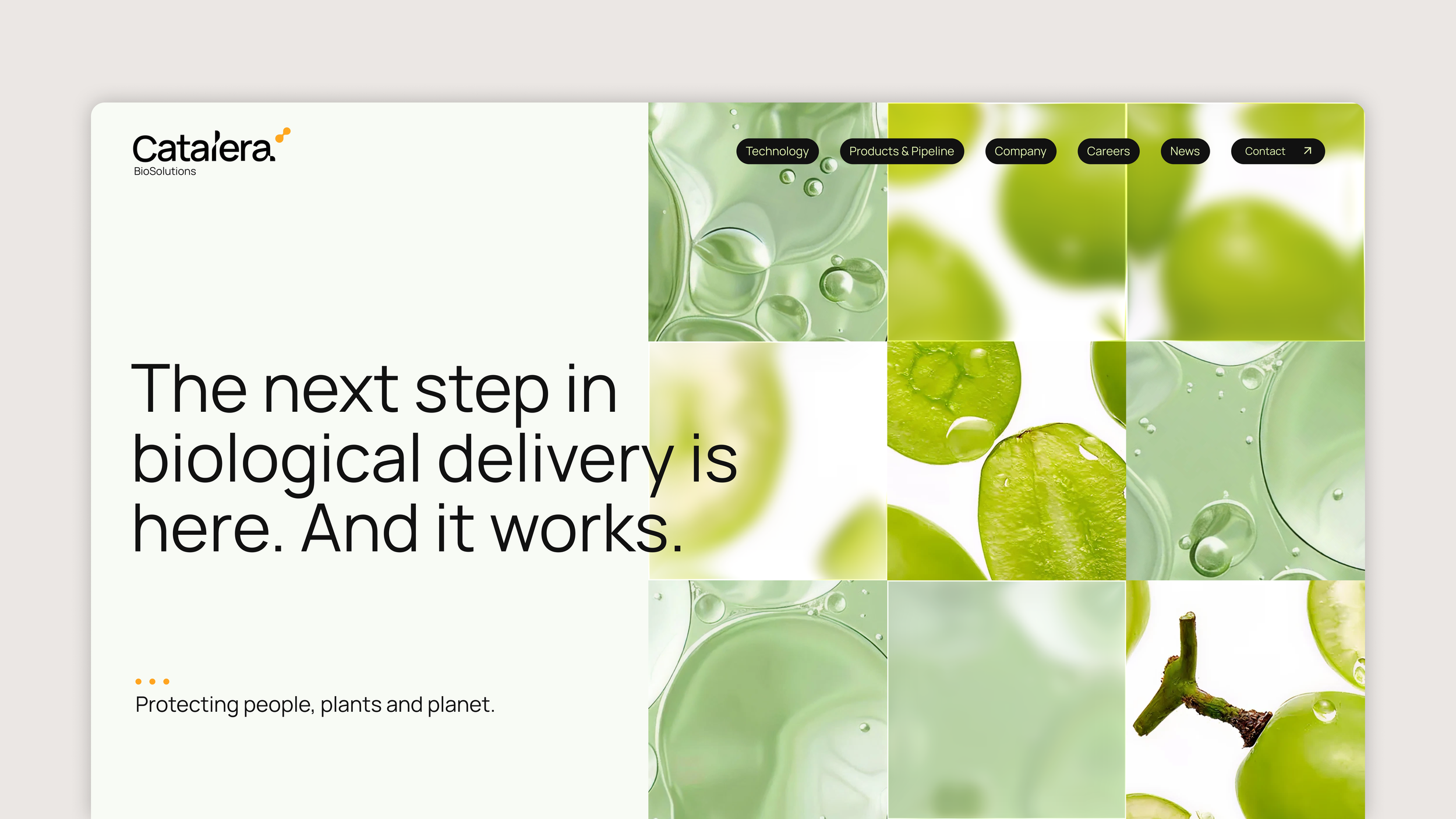
Catalera — 2026
Catalera is an innovative biosolutions brand that’s catalyzing a new era of bio-based pest control. The refreshed art direction highlights the energy and optimism of their future-forward approach in the agriculture tech industry.
I was brought on as a design consultant to explore and define three visual directions for evolving Catalera’s brand. A comprehensive audit of the existing brand and website informed each approach, identifying opportunities to modernize while retaining what was already working. The concepts focused on balancing the aesthetics of science and agriculture, ensuring the visual language felt both credible and distinctive within the category. Direction 3 was ultimately selected as the foundation for the refreshed brand.
Creative Direction + Design: Y Pham
Direction 1
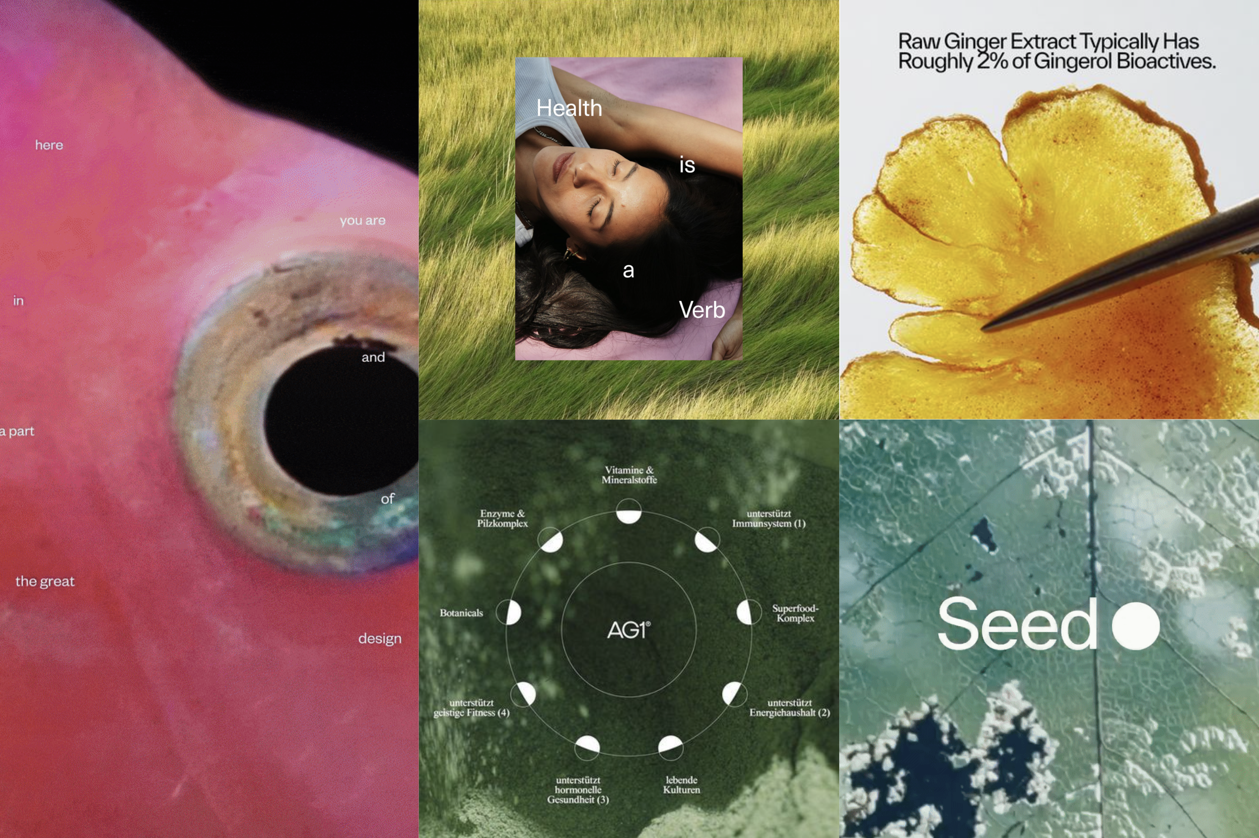
Art + science / Cinematic / Emotive
This direction is artfully scientific, looking at the world from a macro lens while also zooming out to see the full picture. This elevates their current imagery into a space that is more modern and unique compared to their industry counterparts, showing they are at the forefront of innovation and advancement.

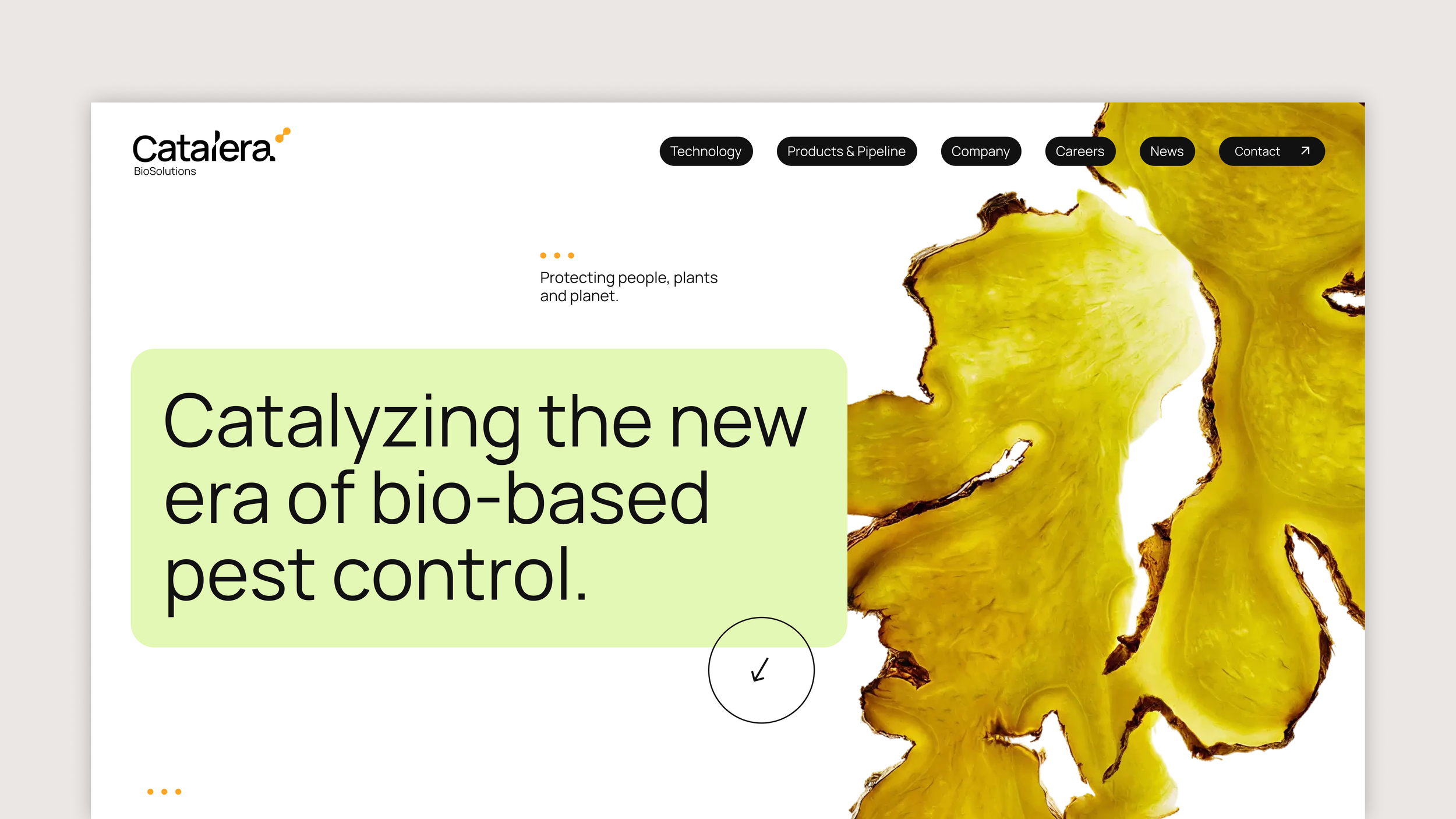
Direction 2
Organic / Functional / Editorial
This builds upon Catalera’s use of organic shapes and framing devices in their existing system to become something more editorial yet functional. These shapes can evolve and flex into a system where it houses imagery (scientific textures), content, or frame important elements.

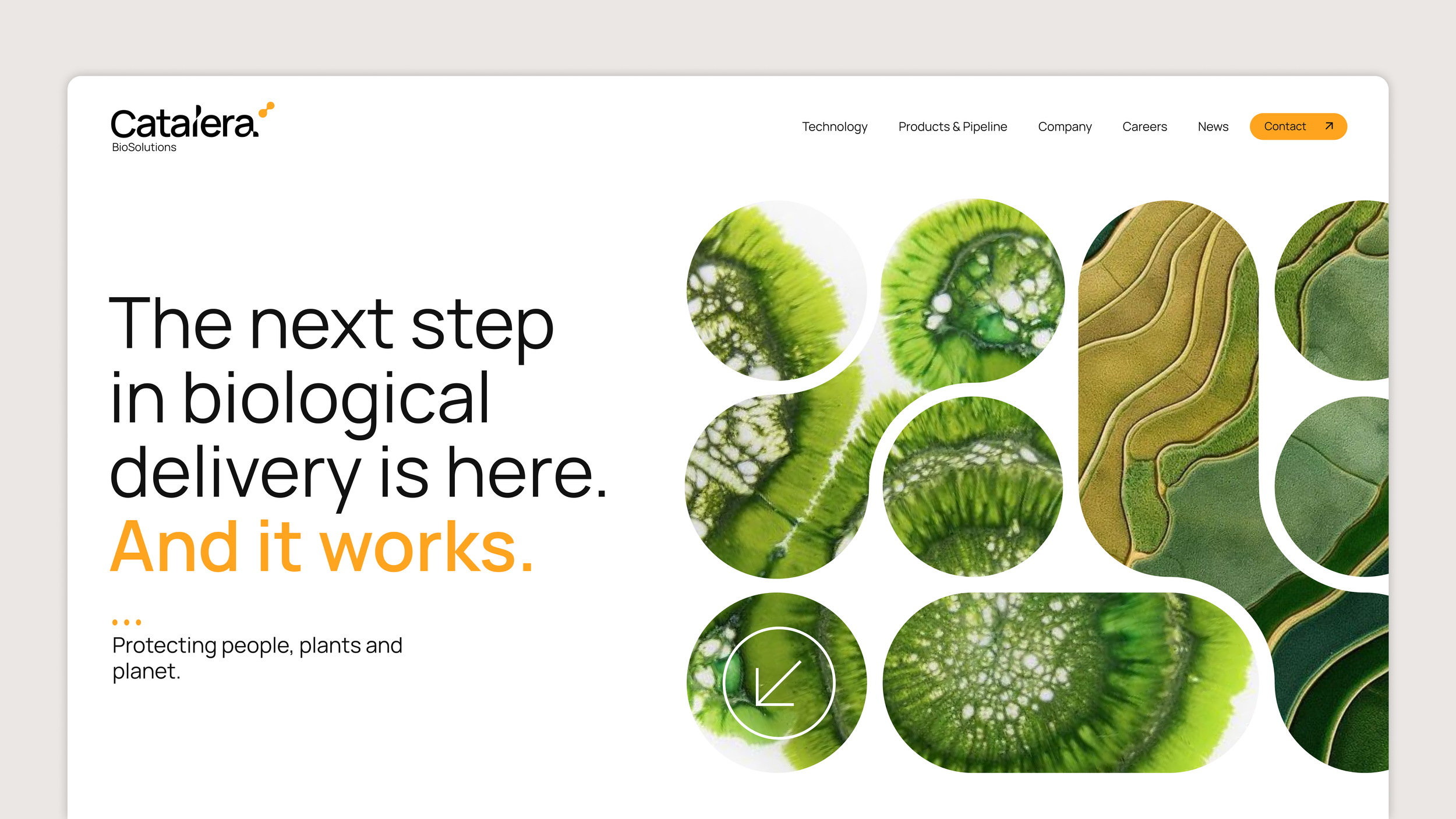
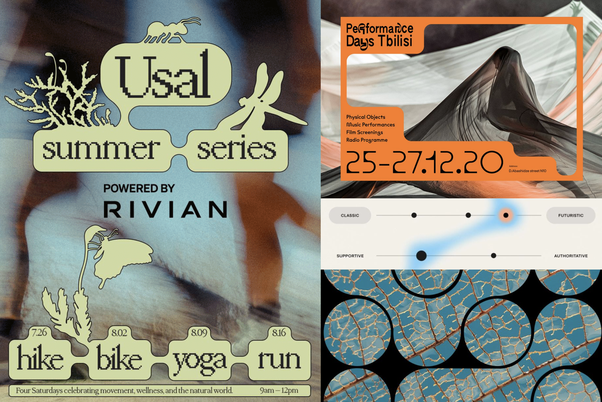
Direction 3
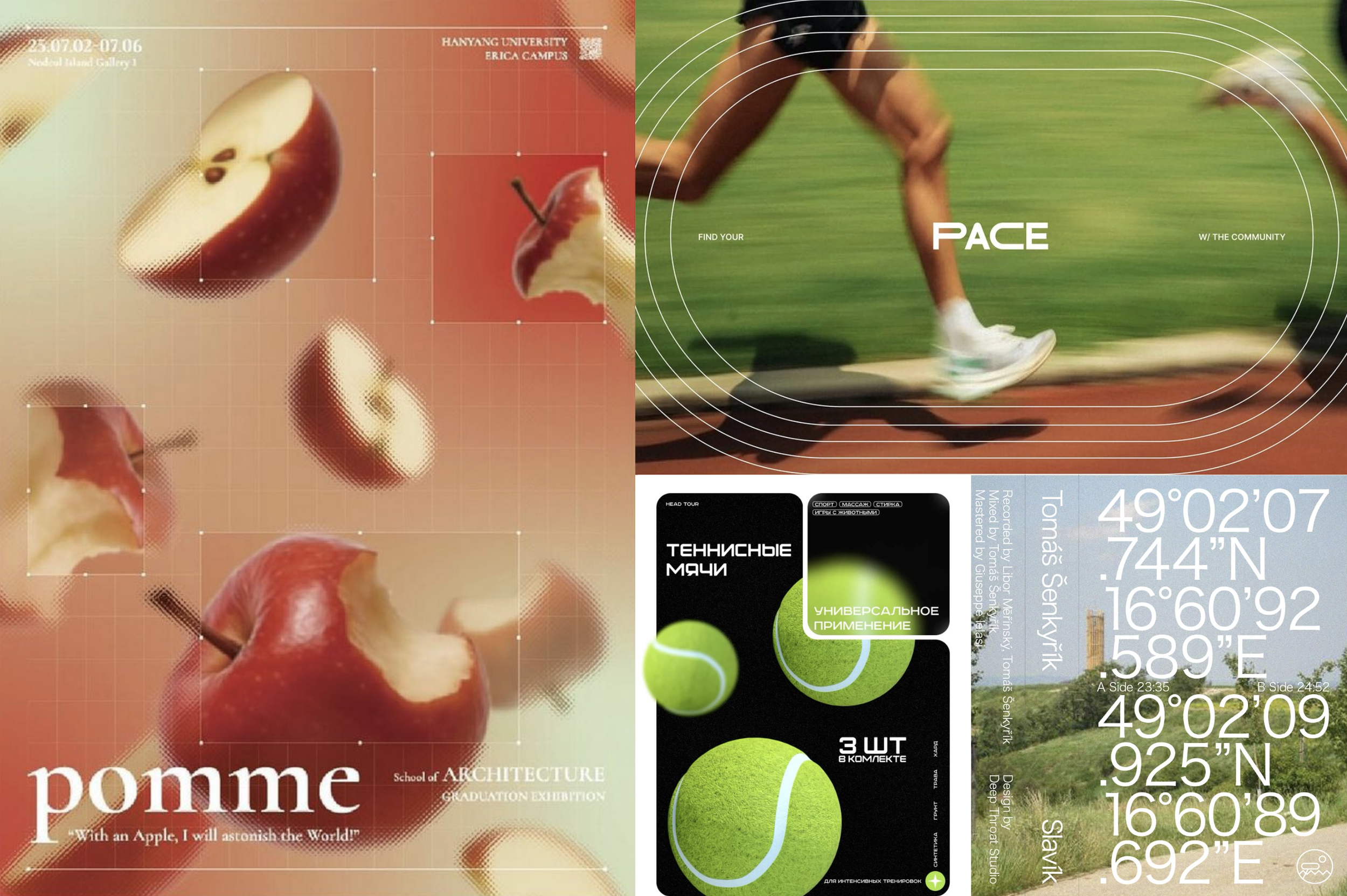
Technical / Dynamic / Futuristic
Inspired by the geometric compositions of croplines, this concept visualizes Catalera’s expertise in the agriculture space as a leader and trendsetter. Technical, scientific elements are paired with earthy imagery. This visual motif speaks to analyzing, enhancing, and improving — much like their products and R+D process.