Public Lands Campaign — 2023
A campaign calling people back to our collective roots in the wild. No matter how far we wander, our true nature is in true nature. Public lands are for anyone who needs to get back to the wilderness—that is, everyone.
Tasked with raising awareness and appreciation for Public Lands by the Foundation for America's Public Lands and Bureau of Land Management, we created a campaign identity and toolkit informed by landscape analysis, in-depth stakeholder interviews, and audience testing to ensure resonance among the different groups. The design focused on loose, organic forms inspired by nature, such as tree rings, lake shapes, and even plant cells. These visual elements were complemented by moments of structure found in the type, ensuring that all points of interaction are clear yet compelling.
Skills at play: art direction, illustration, branding
After the team collected the takeaways from the landscape audit and interviews, we mapped out four different concepts lining up with these insights and paired them with moodboards as an early visualization of how the campaign branding can take shape.
Concept 1: playful, inspiring, unifying | This idea was centered around reconnecting to nature through a sense of awe-inspired play and we showed that through bold geometric shapes laid on top of nature scenes. The photography would showcase people in bright, candid moments, integrating with the type in fresh, fun ways.
Concept 2: active, independent, proud | This direction focused on the freedom that comes with stepping off the beaten path to discover something new. We lean into match-cut visuals, mismatched type, and bold colors for the vibrant energy of doing things your own way.
Concept 3: serene, open, grounded | Focusing on the protected aspect of public lands and its open spaces, this direction highlights the room to just simply be. Minimalism is elevated by the artful nature photography and typographic motion design.
Concept 4: wondrous, expansive, curious | This idea hones in on the question: what could be out there? Showcasing the natural wonders of public lands, the visuals zoom into the ecological marvels and continues this otherworldly feel through the use amorphous type and frames.
From there, Concepts 1 + 2 moved forward into design system development where we explored logo, color, type, and much more.
Logo and identity exploration for Concept 1 | The logo was inspired by the organic forms of plant cells and rock cairns, highlighting multiple elements that come together to form one shape. The photography and color palette also reflects the direction’s warm tone and focus on the connection we have to nature and one another.
Logo and identity exploration for Concept 2 | This direction is all about highlighting the individual's self-expression as seen in the fill-in-the-blank campaign mark and mismatched letters of the wordmark. To balance out the brighter tones in the color palette, the photography is more muted and dark for contrast.
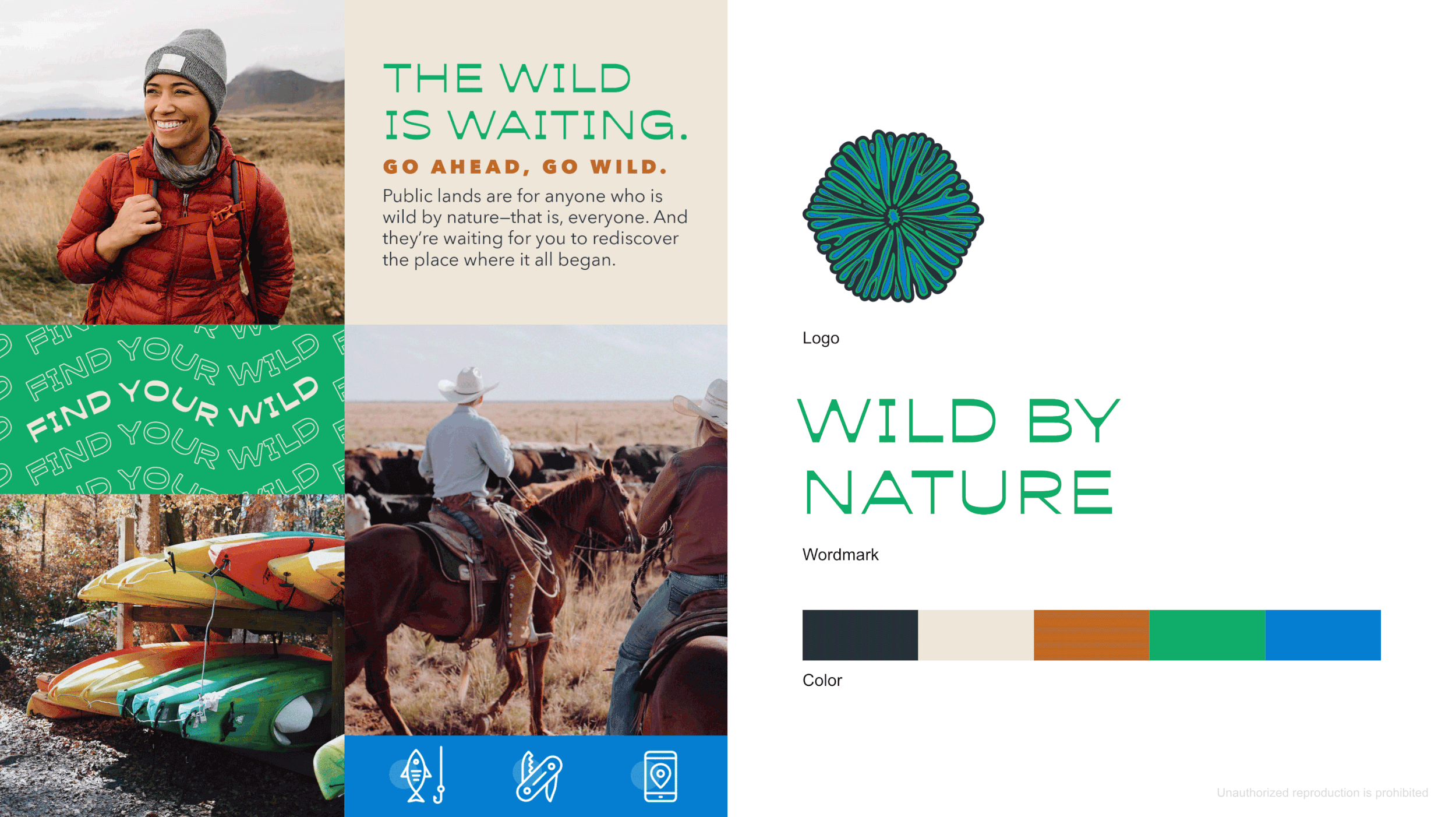
Concept 1 was then built into a full-fledged identity system, showing the logo, various aspects of how the brand comes to life, and sample campaign executions (OOH, social, and display).
Custom illustrations for the campaign mark where the shapes were inspired by tree stumps and rings with lake shapes creating the center of these floral-like compositions. The shapes can come apart and be used as a library of containers for other designs.
After audience testing, the final version was fine-tuned where the organic shapes and type were simplified to maximize readability.